

Choosing the right pocket square colours for wedding suits involves balancing personal style with the occasion’s formality and your suit colour. White and cream pocket squares offer timeless elegance that works with any wedding suit colour, while seasonal choices and wedding themes can guide more adventurous colour selections. The key is coordinating rather than exactly matching with other accessories.
What colours work best for wedding pocket squares?
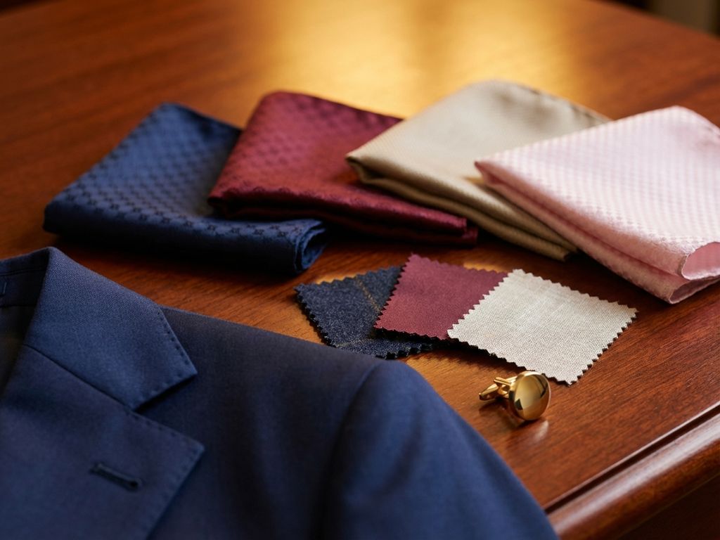
White and cream pocket squares remain the most versatile and elegant choices for wedding suits. These classic colours complement any suit colour, from navy and charcoal to lighter summer wedding suits, creating a sophisticated foundation that never looks out of place.
For spring and summer weddings, soft pastels like pale pink, light blue, or lavender work beautifully with lighter formal wedding suits. These colours add subtle personality while maintaining the refined appearance appropriate for wedding celebrations. Seasonal considerations matter significantly – deeper jewel tones like burgundy or forest green suit autumn ceremonies, while crisp whites and blues enhance summer wedding suits perfectly.
Your wedding theme influences colour choices considerably. Beach weddings call for lighter, breezier colours that complement linen or cotton summer wedding suits. Garden parties allow for floral patterns or nature-inspired greens. Urban celebrations suit more structured colours like grey or navy that pair well with traditional wedding suit colours.
Contemporary colour choices include muted metallics like champagne or soft gold, which add modern elegance without overwhelming your overall look. These work particularly well with charcoal or navy wedding suits, creating subtle contrast that photographs beautifully.
How do you match pocket squares with your wedding suit colour?
Successful pocket square coordination follows complementary colour principles rather than exact matching. Costumes de mariage bleu marine pair excellently with white, cream, light pink, or soft yellow pocket squares. Charcoal suits work beautifully with white, silver, or pale blue options that create gentle contrast without competing for attention.
For black formal wedding suits, stick to white or cream pocket squares to maintain classic elegance. Black suits already make a strong statement, so your pocket square should provide subtle refinement rather than bold colour contrast. This approach ensures your formal wedding suit remains the focal point while adding sophisticated detail.
Lighter summer wedding suits in beige, light grey, or tan offer more colour flexibility. These suits accommodate bolder pocket square choices like coral, mint green, or lavender. The lighter base allows these colours to appear sophisticated rather than overwhelming, perfect for outdoor or casual wedding celebrations.
Common matching mistakes include choosing pocket squares that exactly match your tie colour or selecting colours that clash with your skin tone. Instead, aim for harmonious coordination where colours complement each other while maintaining distinct identities. This creates visual interest without appearing overly calculated or overly matchy.
Should your pocket square match your tie or boutonniere?
Modern wedding styling favours coordination over exact matching between pocket squares, ties, and boutonnieres. Creating cohesive looks means selecting accessories that complement each other while maintaining individual character. This approach appears more sophisticated and naturally elegant than perfectly matched sets.
The coordination philosophy works by choosing accessories within the same colour family but in different shades or textures. For example, if your boutonniere features white roses with green foliage, your pocket square might be cream or pale green rather than matching white. Your tie could incorporate similar tones without replicating the exact colours.
Balancing pocket squares with other wedding accessories requires considering the overall visual weight. If your boutonniere is particularly elaborate or colourful, choose a more subdued pocket square that won’t compete for attention. Conversely, a simple boutonniere allows for slightly more adventurous pocket square choices that add personality to your wedding suit colours.
Contemporary styling approaches often feature one standout accessory while keeping others more neutral. You might choose a patterned tie with a solid pocket square, or a coloured pocket square with a neutral tie. This prevents your accessories from overwhelming your wedding suit while ensuring your personal style shines through appropriately.
What pocket square colours should wedding guests avoid?
Wedding guests should avoid bright, attention-grabbing colours like electric blue, hot pink, or vibrant red that might upstage the couple or appear inappropriate for the celebration’s tone. These colours can photograph poorly and draw unwanted attention during important moments like ceremonies or formal photos.
Seasonal appropriateness matters significantly when selecting pocket square colours. Avoid heavy, dark colours like deep purple or black for spring and summer weddings, as these appear out of sync with the celebratory atmosphere. Similarly, bright tropical colours rarely suit formal winter ceremonies or evening celebrations.
Venue considerations influence appropriate colour choices substantially. Beach weddings call for avoiding colours that clash with natural settings – neon shades appear particularly jarring against ocean or garden backdrops. Church ceremonies typically require more conservative colour choices, while outdoor celebrations allow slightly more flexibility within respectful boundaries.
Choose colours that complement the wedding’s formality level rather than challenging it. Ultra-formal evening weddings require subdued, classic colours like white, cream, or soft grey. Casual daytime celebrations accommodate slightly more personality, but always within tasteful limits that respect the couple’s special day.
Consider how your pocket square photographs alongside other guests and the wedding party. Colours that appear flattering in person might photograph differently, particularly in group shots. Classic, understated choices ensure you look appropriately dressed while allowing the couple to remain the celebration’s visual focus.
Selecting the perfect pocket square colour enhances your wedding attire while respecting the occasion’s significance. Whether you’re choosing summer wedding suits for outdoor celebrations or formal wedding suits for traditional ceremonies, thoughtful colour coordination creates lasting style that photographs beautifully. We specialise in helping grooms and wedding guests achieve this perfect balance through our comprehensive wedding suit tailoring service, ensuring every detail contributes to your confident, elegant appearance on these important occasions.
Articles connexes
- 4 étapes pour trouver le costume de mariage idéal pour l'été
- Quelle est la différence entre suspendre et plier un costume ?
- Comment acheter un paquet de cigarettes ?
- Quelle est la différence entre le nettoyage à sec et le nettoyage à l'eau d'un costume ?
- Comment traiter les taches d'eau sur une veste de costume ?