

Groomsmen don’t need to wear identical navy shades, but coordinating their looks creates better visual harmony in wedding photos. The key is choosing complementary navy tones rather than exact matches, which allows for budget flexibility while maintaining a cohesive appearance. Understanding navy variations and coordination strategies helps create the perfect balance between uniformity and individual style preferences.
What’s the difference between navy suit shades and why does it matter?
Navy suits range from deep midnight navy to lighter slate blues, with each shade creating different visual impacts in photos and various lighting conditions. The differences become particularly noticeable when suits are placed side by side, making coordination important for wedding party harmony.
Midnight navy appears almost black in low light but reveals rich blue undertones in bright conditions. This deepest shade works beautifully for evening ceremonies and formal venues. Standard navy offers the most versatile option, sitting perfectly between dark and medium tones while complementing most skin types and wedding colour schemes.
Lighter navy shades, sometimes called slate or powder navy, create a softer appearance that works particularly well for daytime ceremonies and outdoor weddings. These lighter tones photograph beautifully in natural lighting but can appear washed out in dim conditions.
Fabric type significantly affects how navy appears. Wool suits tend to hold deeper, richer navy tones, while cotton and linen blends often appear lighter and more casual. The fabric’s texture also influences light reflection, making some navy shades appear more vibrant or muted depending on the weave.
Wedding photography amplifies these differences. Professional lighting and camera settings can make subtle shade variations appear more pronounced in photos. What looks coordinated to the naked eye might appear mismatched in your wedding album if the navy variations are too extreme.
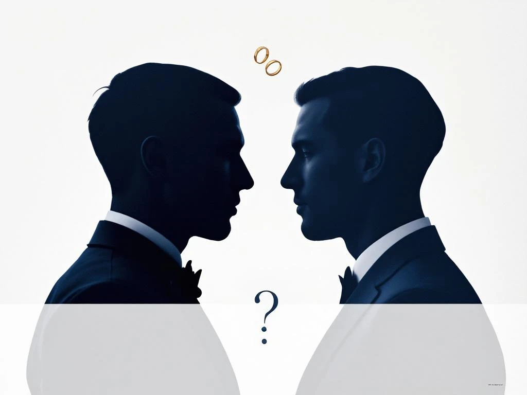
Should all groomsmen wear exactly the same navy shade?
Identical navy matching creates the most uniform appearance but isn’t necessary for a polished wedding party look. Coordinated navy tones within the same shade family often appear more natural and accommodate different budgets, body types, and personal preferences while maintaining visual cohesion.
Perfect matching offers undeniable benefits. Your wedding party will look incredibly sharp and professional in photos, creating that classic, timeless aesthetic many couples desire. This approach works particularly well for formal ceremonies and traditional wedding styles where uniformity enhances the overall elegance.
However, exact matching can present practical challenges. Budget constraints might prevent some groomsmen from purchasing identical suits, especially when working with premium fabrics or made-to-measure options. Different body types may also look better in varying cuts or styles, even within the same colour family.
Coordinated approaches offer more flexibility while maintaining visual appeal. Choosing navy shades within the same tonal range allows each groomsman to select options that suit their budget and body type. This method works particularly well when you’re mixing different suit sources or accommodating groomsmen in different locations.
Consider your wedding style when making this decision. Formal black-tie events typically benefit from exact matching, while outdoor or casual ceremonies can embrace more relaxed coordination. The venue’s lighting and your photographer’s style also influence how noticeable shade differences will appear in your final photos.
How do you coordinate groomsmen suits when they can’t all match perfectly?
Create cohesion through consistent accessories, similar fabric textures, and unified styling choices rather than identical suits. Focus on matching ties, pocket squares, and shoes while allowing navy shade variations within the same tonal family to maintain visual harmony without perfect uniformity.
Accessories provide the strongest coordination tool when suit shades vary slightly. Identical ties, bow ties, or cravats create an instant visual connection across the wedding party. Choose accessories in colours that complement all navy variations you’re working with, such as burgundy, gold, or classic white.
Pocket squares offer another coordination opportunity. Matching pocket square colours or patterns helps tie different navy shades together beautifully. You can even use pocket squares to introduce your wedding colours while maintaining the navy foundation.
Shoe coordination is often overlooked but incredibly effective. Black or brown leather shoes in the same style create uniformity from the ground up. This consistency helps balance any navy variations in the suits themselves.
Consider fabric textures when coordinating different navy shades. Mixing a smooth wool navy with a textured linen navy creates more visual disruption than combining two smooth fabrics in slightly different navy tones. Aim for similar fabric weights and finishes when possible.
Styling consistency matters tremendously. Ensure all groomsmen follow the same approach to buttoning, fit, and overall presentation. Well-fitted suits in coordinated navy shades always look better than identical ill-fitting suits.
What are the most common navy suit coordination mistakes to avoid?
The biggest mistakes include mixing drastically different fabric types, ignoring venue lighting conditions, choosing clashing accessories, and leaving coordination decisions until the last minute. These issues can disrupt your wedding’s visual harmony and create awkward photo moments that could easily be avoided.
Fabric mixing creates the most jarring coordination problems. Combining formal wool navy suits with casual cotton or linen alternatives rarely works well, even when the colours match perfectly. The different textures and formality levels create visual discord that’s particularly noticeable in photos.
Lighting miscalculations cause many coordination disasters. Navy suits that look perfectly matched in indoor lighting can appear completely different outdoors. Always view your chosen navy shades in the actual lighting conditions where your ceremony and photos will take place.
Accessory clashes undermine even well-coordinated navy suits. Mixing silver and gold accessories, combining different leather colours, or choosing accessories that complement only some navy shades creates visual chaos. Stick to one metal tone and consistent leather colours throughout your wedding party.
Timing issues create unnecessary stress and poor results. Leaving suit coordination until weeks before the wedding limits your options and increases costs. Start coordinating navy shades at least three months before your wedding date to allow time for adjustments and alternatives.
Size and fit inconsistencies make even identical navy suits look mismatched. Ensure all groomsmen have properly fitted suits, regardless of shade variations. Poor fit draws attention away from your careful colour coordination and affects the overall wedding party appearance.
Ignoring the groom’s suit in coordination planning creates a disconnect between the groom and his party. Whether you choose a navy wedding suit or a grey wedding suit for the groom, ensure it complements rather than competes with your groomsmen’s navy choices.
Creating a cohesive groomsmen look requires thoughtful planning rather than perfect matching. Focus on complementary navy tones, consistent accessories, and proper fit to achieve the polished appearance you want for your special day. Understanding how it works when coordinating multiple suits can streamline the process significantly. If you need guidance on suit coordination or have questions about creating the perfect wedding party look, don’t hesitate to reach out. When you’re ready to explore navy wedding suit options that coordinate beautifully with your wedding party vision, contact us to help you create the perfect look for your celebration.